Below are the rules for the treatment of text and images in Posts
General rules
- Right column
- Always delete the right column if empty: see wrong page
- Pay attention to links or right column thinking to the mobile view. On this page the right box is not necessary , the links to registration goes in the body since on the mobile the right box goes down
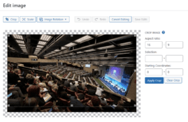
- Images size
- Crop any type of image in 16:9
- Especially the Featured image associated to the Post
- Image within the text
- Chapter title rules
- Use only the Headings system (Heading 1, Heading 2, Heading 3 …), never the Bold, see example
- Heading 1 is already used by the tile of the Post just above the featured image
- Therefore within the text respect the progressive numerical sequence starting from Heading 2, then Heading 3, Heading 4 ..
- First chapter of the text
- The first paragraph of a Post becomes the excerpt on the catalog page, it must be written as a summary for each entry
- In case of an event: date and location are mandatory at the beginning of the first paragraph, see example
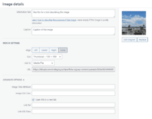
- Links to PDF or external web pages
- Always opened in a new window


